
You just finished a 3-hour study session. You're tired but you feel productive.
Then, a nagging question pops into your head: Did I actually get any better?
If you're like most AFK candidates, you're navigating your prep journey in a fog. You're relying on gut feelings, hoping that just putting in the hours will lead to a better score. You're studying blind.
What if you could turn on the lights?
What if you had a personal GPS for your AFK prep, telling you exactly where to turn, where you're speeding, and where you're stuck in traffic? That's what data-driven preparation is all about. It's time to stop guessing and start knowing.
Welcome to your new Performance Command Center in QuizOdontist. Let's take a tour.
Step 1: Know Your Battlefield - Subject-wise Analytics
Before you can win the war, you need to understand the map. Subject-wise Analytics gives you an honest, data-driven view of your preparation, showing you where you're strong and where you need to send in reinforcements.
Chart 1: The Effort Audit (Mocks Distribution by Subject)
Description: This pie chart answers the most important question: "Where is my practice effort really going?" It's a simple audit of your study habits, showing the proportion of mocks you've attempted for each subject. It often reveals a subconscious bias towards subjects we find easier or more enjoyable—our "comfort zones."
The Insight: The Practice Volume vs. Exam Weight Check.
Use this chart to audit your practice volume against the official NDEB blueprint. If a subject like Restorative & Prosthodontics makes up 16% of the AFK exam, it should command a significant portion of your practice attempts. If your chart shows you've attempted 100 mocks in a subject that's only 6% of the exam, but only 10 mocks in a 16% heavyweight, you've just discovered a critical mismatch in your strategy.
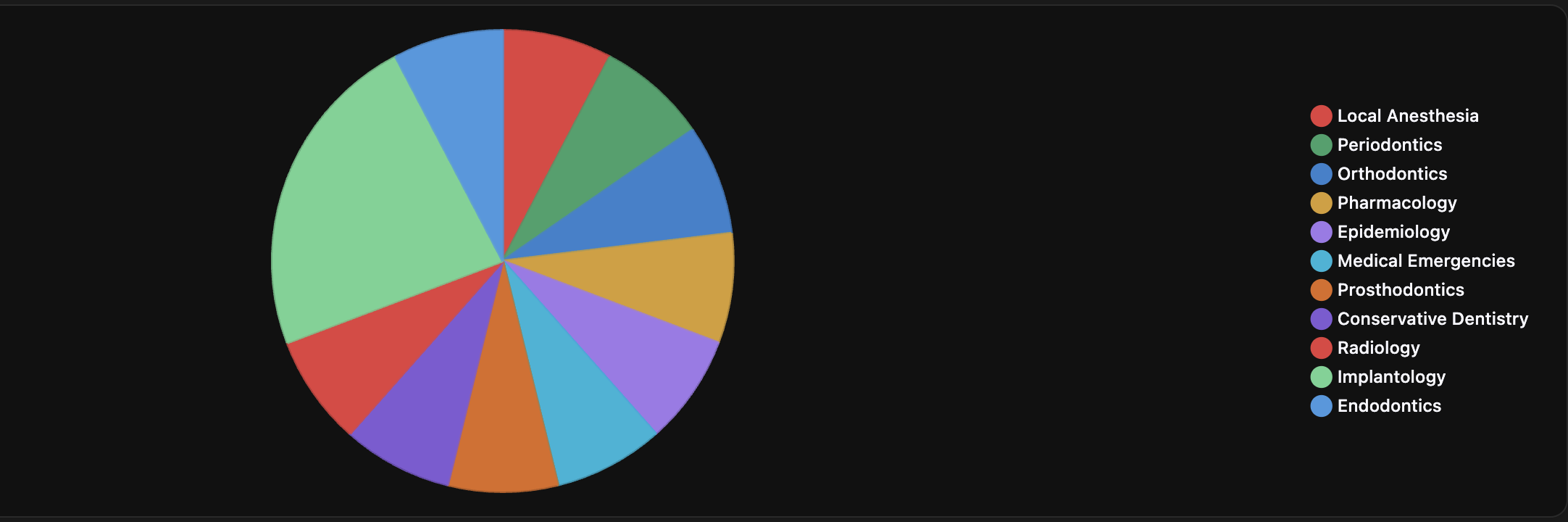
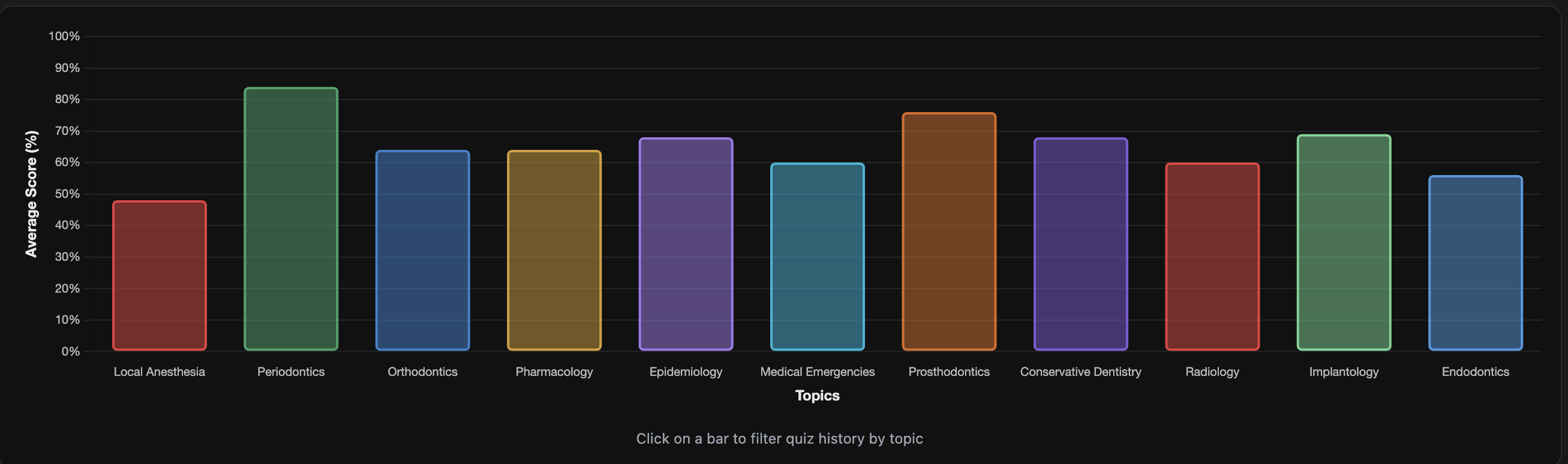
Chart 2: The Honest Mirror (Performance Analysis by Subject)
Description: Feelings aren't facts. You might feel confident in Pharmacology, but this chart shows you the cold, hard data. It is the single source of truth for identifying where you are actually losing points, cutting through gut instincts and wishful thinking.
The Insight: Find Your #1 Target.
This chart builds your attack plan for you. It doesn't care about your feelings; it shows you your scores. That 55% you're getting in Oral Pathology? That's your new #1 priority. The lowest bar on this chart is the very next subject you need to build a "Weakness Buster" custom mock for. It removes all guesswork and tells you exactly what to study right now.
Step 2: Diagnose Your Confidence - Difficulty Analytics
Are you actually good at a subject, or are you just good at the easy questions in that subject? This is where you separate true mastery from false confidence. These charts help you diagnose the reliability and depth of your knowledge.
Chart 1: The Performance Audit (Score Analysis)
This section answers two critical questions:
- How well do I perform at each difficulty level?
- How reliable is that performance?
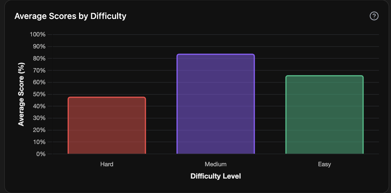
The Bar Chart: Your Knowledge Depth Test
Description: This is your first and most important signal. The bar chart is a straightforward report card showing your average score for Easy, Medium, and Hard questions. It immediately reveals the gap between knowing a fact and applying it under pressure.
The Insight: The "Mastery Gap" Check.
Look at the difference between your "Easy" bar and your "Hard" bar. A small gap means your knowledge is deep and applicable. A large gap (e.g., 90% on Easy, 45% on Hard) is a major red flag. It tells you that while you can recall basic facts, you're struggling to apply them in complex, multi-step scenarios, which is exactly what the AFK tests. Your goal is to make these bars as even as possible.
The Box Plot: The Consistency Story
Description: An average score can be deceiving. A 60% average could mean you consistently score 60%, or it could be a mix of 100s and 20s. The Box Plot tells the story behind the average, revealing the consistency of your knowledge. A short, tight box is the goal.
The Insight: Pinpoint Your Inconsistencies.
A long, stretched-out box, especially on "Hard" questions, means your performance is a gamble. It reveals that you have specific knowledge gaps within that difficulty level. You're acing some complex questions but completely missing others. The action plan is clear: review the subjects from the mocks in that long box to turn it into a tight, confident cluster.
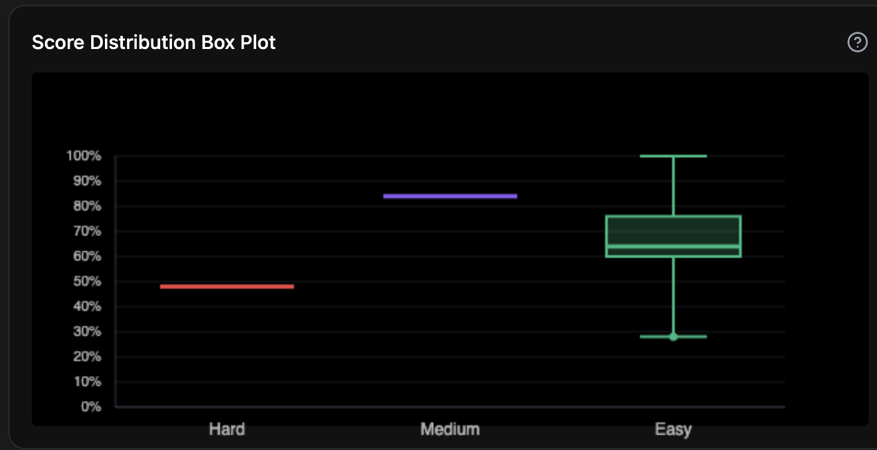
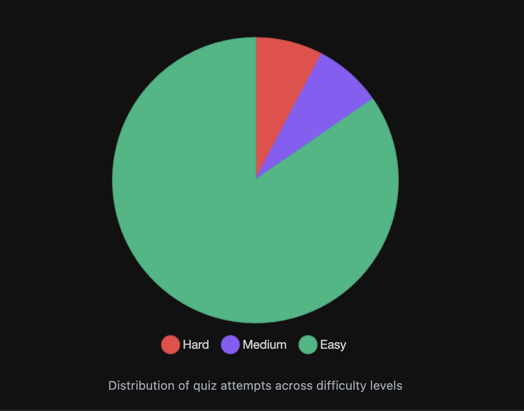
Chart 2: The Comfort Zone Audit
This pie chart is a simple audit of your study habits. It answers the question: "Am I truly challenging myself, or am I just practicing what's easy?" It shows the proportion of mocks you've attempted at each difficulty level.
The Insight: Are You Training for a Real Fight?
This chart reveals if you're genuinely preparing for the AFK or just practicing what you're already good at. If this chart is overwhelmingly green ("Easy"), you're like a boxer only hitting the speed bag. To win the match, you have to get in the ring and spar. This chart tells you when it's time to intentionally use the Custom Mock Builder to create more "Hard" and "Mixed" difficulty mocks to simulate real exam pressure.
Step 3: Master the Clock - Time Analytics
The AFK isn't just a test of what you know; it's a test of how efficiently you can apply that knowledge under pressure. Speed matters. These charts help you diagnose your pacing and turn time into your ally.
Chart 1: The Hesitation Finder (Time and Subject Analysis)
Description: This chart doesn't just show you how much time you spend on a subject; it reveals your "cognitive friction." A long bar indicates a subject that is causing you to hesitate, second-guess, and re-read questions. It's a direct measure of how fluidly you can recall and apply knowledge for that subject.
The Insight: Identify and Eliminate Your Time Sinks.
A bar that's significantly longer than the others is a massive red flag. It means that subject has a high probability of bogging you down on exam day. This isn't a speed problem; it's a knowledge fluency problem. The action plan is to go back to that subject's fundamentals. When you truly master the core concepts, your recall becomes instant, your hesitation disappears, and that bar will shrink.
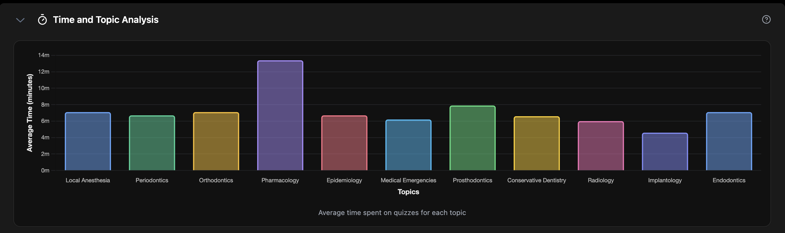
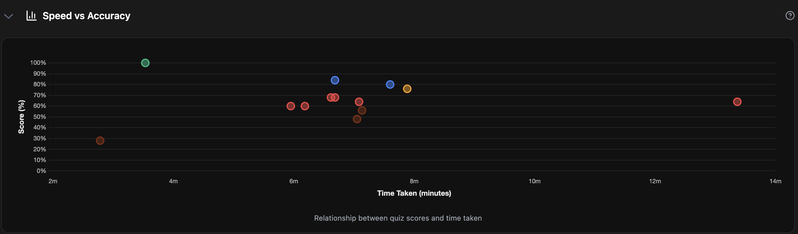
Chart 2: The Performance Quadrant (Speed vs. Accuracy)
Description: This scatter plot is arguably the most powerful diagnostic tool on the entire dashboard. It separates your knowledge from your test-taking skill. Each dot represents a mock exam, showing the relationship between your score (accuracy) and your time (speed). Your goal is to move every dot into the top-right "Mastery Zone."
The Insight: Diagnose Your Test-Taking Style.
Find where most of your dots are clustered and get your diagnosis:
- Top-Right (The Scholar): High Score, Slow Time. Your knowledge is excellent, but you're overthinking or too cautious. You need to work on trusting your first instinct and improving your speed.
- Top-Left (The Mastery Zone): High Score, Fast Time. This is the goal. Your knowledge is solid and your pacing is perfect.
- Bottom-Right (The Foundation Builder): Low Score, Slow Time. This is a sign of foundational knowledge gaps. The focus here should be on untimed practice to understand the concepts, not on speed.
- Bottom-Left (The Rusher): Low Score, Fast Time. You're moving too quickly and making careless mistakes. You need to slow down, read the questions more carefully, and focus on accuracy over speed.
From Guesswork to Game Plan: Your Data is Your Roadmap
Your performance data tells a story. It's a story that answers the three most critical questions in your AFK prep:
- What should I study next? (Topic Analytics)
- How deep is my knowledge? (Difficulty Analytics)
- Where am I losing time? (Time Analytics)
When you have the answers to these questions, you stop studying blind. You replace the anxiety of the unknown with the confidence of a clear strategy. You're no longer just guessing; you're executing a data-driven game plan.
This level of insight isn't a "nice-to-have"; it's the foundation of modern, effective preparation. And it's built into the very core of your Quizodontist dashboard, waiting for you to use it.
The path to a passing score isn't about studying harder—it's about studying with intelligence.