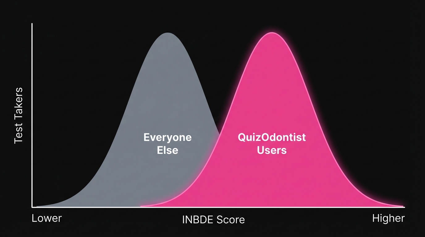
Nobody goes to dental school because they love statistics.
You survived organic chemistry. You powered through anatomy. You're comfortable drilling into enamel. But somewhere in your INBDE prep, you hit the biostatistics section and thought: I'll come back to this later.
Later never comes. And then you're sitting in Prometric, staring at a table with numbers in four boxes, trying to remember whether sensitivity uses the rows or the columns.
Here's what most candidates don't realize: biostatistics questions follow patterns. The same chart types appear over and over. Once you've seen each one enough times, the patterns click. This post covers the three foundational chart types—the ones you'll see most often and need to recognize instantly.
Why Biostatistics Is Free Points
Roughly 10% of the INBDE—about 50 questions—falls under Foundation Knowledge Area 10 (FK10): Biostatistics, Research Design, and Evidence-Based Dentistry.
Fifty questions. That's significant.
Everyone studies pharmacology. Everyone reviews oral pathology. Almost nobody spends serious time on biostatistics because it doesn't feel like "real dentistry." That's exactly why it's an opportunity. The questions follow predictable patterns. Learn the patterns, bank the points, move on.
This is Part 1 of a three-part series:
- Part 1 (this post): 2x2 Tables, Box Plots, Scatter Plots
- Part 2: Advanced Chart Types: Forest Plots, Survival Curves, ROC Curves
- Part 3: Concepts Without Charts: P-values, Confidence Intervals, Study Design, Errors
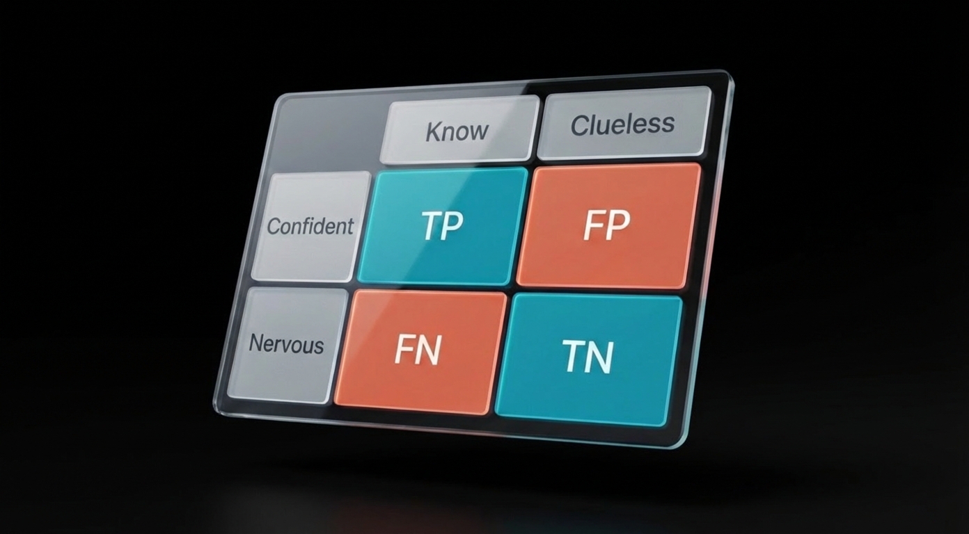
The 2x2 Table: Half the Battle
If you learn one chart from this series, make it this one.
The 2x2 table shows up constantly because it's how researchers report diagnostic test accuracy. You've used diagnostic tests your entire clinical training—you just haven't thought about the math behind them.
Here's the scenario: A researcher wants to know if a screening test actually works. They test a bunch of patients, then confirm who really has the disease using a "gold standard" (like a biopsy). The results go into four boxes:
| Actually Has Disease | Actually Healthy | |
|---|---|---|
| Test Said "Positive" | Correct! (True Positive) | Oops, false alarm (False Positive) |
| Test Said "Negative" | Missed it (False Negative) | Correct! (True Negative) |
That's the whole table. Four possible outcomes:
- True Positive (TP) — The test said "positive" and it was right. The patient actually has the disease.
- False Positive (FP) — The test said "positive" but it was wrong. The patient is actually healthy. (A false alarm.)
- False Negative (FN) — The test said "negative" but it was wrong. The patient actually has the disease. (A missed case.)
- True Negative (TN) — The test said "negative" and it was right. The patient is actually healthy.
Every sensitivity, specificity, PPV, and NPV question on the INBDE comes from dividing these four boxes in different ways:
- Sensitivity = "Of everyone who's actually sick, how many did we catch?" → TP ÷ (TP + FN)
- Specificity = "Of everyone who's healthy, how many did we correctly clear?" → TN ÷ (TN + FP)
- PPV (Positive Predictive Value) = "If the test says positive, what are the odds they're actually sick?" → TP ÷ (TP + FP)
- NPV (Negative Predictive Value) = "If the test says negative, what are the odds they're actually healthy?" → TN ÷ (TN + FN)
Where students get tripped up: The formulas all look similar. Under exam pressure, students mix up which denominator goes with which question.
The fix isn't to memorize harder. The fix is to understand what you're being asked:
- Sensitivity and Specificity start with the truth (columns). "Of everyone who actually has disease..." or "Of everyone who's actually healthy..."
- PPV and NPV start with the test result (rows). "Of everyone who tested positive..." or "Of everyone who tested negative..."
When you see a question, ask yourself: Is this asking about people with a certain disease status, or people with a certain test result? That tells you whether to divide by a column total or a row total.
Try this one:
A dental school evaluates visual examination for detecting oral cancer in 280 patients, using histological biopsy as the gold standard.
Visual Examination vs. Biopsy Results
| Disease +Biopsy Positive (Malignant) | Disease -Biopsy Negative (Benign) | Total | |
|---|---|---|---|
| Test +Visual Exam Positive | 36TP | 60FP | 96 |
| Test -Visual Exam Negative | 6FN | 178TN | 184 |
| Total | 42 | 238 | 280 |
That last question—about prevalence affecting PPV and NPV—shows up on almost every INBDE. Burn this into your memory:
When prevalence drops, PPV drops and NPV rises. When prevalence rises, PPV rises and NPV drops. Sensitivity and specificity don't change.
Why does this matter clinically? A screening test that works great in a high-risk specialty clinic (high prevalence) might produce tons of false alarms when used on the general population (low prevalence). The INBDE loves testing whether you understand this.
Box Plots: "Is This Difference Real?"
You've seen box plots before—those rectangles with lines sticking out. On the INBDE, they almost always appear in pairs, comparing two groups.
The question is always some version of: "Is the difference between these groups statistically significant, or could it be random chance?"
How to read the plot:
- The line in the middle of the box = median (middle value)
- The box edges = 25th and 75th percentiles (where the middle 50% of data falls)
- The whiskers = range of the data (excluding outliers)
- If the boxes barely overlap, the groups are probably different
But the real answer comes from the statistical test. You need to understand:
- Why paired vs. independent? Same patients measured twice = paired. Different patients in each group = independent.
- What does the p-value mean? Small p (usually < 0.05) = probably not random chance. Large p = could easily be random.
- Statistical vs. clinical significance? A tiny p-value doesn't mean the difference matters clinically. A 0.1 mm pocket depth reduction with p = 0.001 is statistically significant but clinically meaningless. Always ask: "Would this change my treatment?"
- What if the data is weird? Non-normal data needs a different test (Wilcoxon or Mann-Whitney).
A clinical study measures Probing Pocket Depth (PPD) in 15 patients before and after Scaling and Root Planing (SRP).
Probing Pocket Depth Before and After SRP
Memorize this decision tree:
| Situation | Standard Test | If Data Is Skewed |
|---|---|---|
| Same subjects, two time points | Paired t-test | Wilcoxon Signed-Rank |
| Different subjects, two groups | Independent t-test | Mann-Whitney U |
| Three or more groups | ANOVA | Kruskal-Wallis |
The INBDE will describe a study and ask which test is appropriate. Read carefully: "same patients measured before and after" = paired. "Patients randomized to treatment or control" = independent.
Scatter Plots: "Does X Predict Y?"
Scatter plots show dots scattered across a graph. Each dot is one patient (or one data point). The question is whether there's a pattern—do the dots trend upward, downward, or just spray randomly?
Two key numbers show up with scatter plots:
- r (correlation coefficient): How strong is the relationship? Ranges from -1 to +1. Closer to the extremes = strong. Closer to 0 = weak.
- R² (coefficient of determination): What percentage of the outcome can be explained by the input? R² of 0.80 means 80% of the variation is explained.
The trap everyone falls into: Seeing a strong correlation and assuming causation. "Sugar intake correlates with cavities" doesn't prove sugar causes cavities—maybe people who eat more sugar also brush less. That third factor (oral hygiene) is called a confounding variable, and the INBDE loves asking about it.
Researchers examine the relationship between frequency of fermentable carbohydrate intake and DMFT scores in 15 patients.
Quick reference:
- r = 0.9 → Strong positive (as X goes up, Y goes up)
- r = -0.9 → Strong negative (as X goes up, Y goes down)
- r = 0.2 → Weak (barely any pattern)
- R² = 0.81 → 81% of variation explained (note: R² = r², so r of 0.9 gives R² of 0.81)
What You Now Know
If you've worked through the questions above, you can now:
-
Read a 2x2 table and calculate sensitivity, specificity, PPV, and NPV without mixing up denominators. You know that sensitivity and specificity are fixed properties of the test, while PPV and NPV shift with prevalence.
-
Interpret a box plot comparison and identify whether the study used a paired or independent test—and why that matters. You know that "same patients, two time points" means paired, and you know the non-parametric alternatives when data isn't normal.
-
Look at a scatter plot and distinguish correlation from causation. You can spot confounding variables, and you won't fall for the trap of assuming a regression equation proves that changing X will change Y.
These three chart types account for the majority of biostatistics questions. But they're also the ones most candidates feel comfortable with.
The Charts That Make People Freeze
Forest plots. Survival curves. ROC curves.
These are where candidates lose points—not because they're harder, but because they're unfamiliar. You see a bunch of horizontal lines with squares and diamonds, or two curves that cross somewhere in the middle, and your brain doesn't know where to start.
The good news: each of these charts answers exactly one question. Learn what that question is, and the chart reads itself.
- Forest plot: "What do all these studies say when combined?"
- Survival curve: "How long until the event happens?"
- ROC curve: "Which diagnostic test is better?"
That's it. Three charts, three questions.
Continue to Part 2: Advanced Charts →
Or if you want to tackle the concepts that appear without any chart—p-values, confidence intervals, study design, Type I and II errors—jump to Part 3: Concepts Without Charts.
Sources: