You took ten quizzes this week. Your average says 68%. Is that good? Bad? Should you change something or keep going?
Your dashboard knows. But only if you know how to read it.
The numbers at the top are the part everyone sees. The parts that actually change your prep — the trend line, the analytics tabs, the history table — are the parts most people scroll past.
Stats cards

Three cards under the Your Metrics heading.
Tests Taken — Practice quizzes, subject mocks, and custom mocks combined. This number matters because your analytics are noise until you've got enough data. Under 10 tests, your charts don't mean much. Above 20, the patterns are real.
Questions — Total questions answered across all attempts. This is your coverage meter. Hundreds of questions across 3 subjects is a different story from hundreds across 15. If the number looks impressive but you've been drilling the same two topics, you've got blind spots you can't see from here.
Avg. Score — Your running average. This is the number most candidates fixate on. Don't.
A candidate who scored 50% on their first 5 quizzes and 85% on their last 10 still shows 73%. The average tells you where you've been, not where you are. The Score Trend is the chart that reflects your current level.
Score Trend
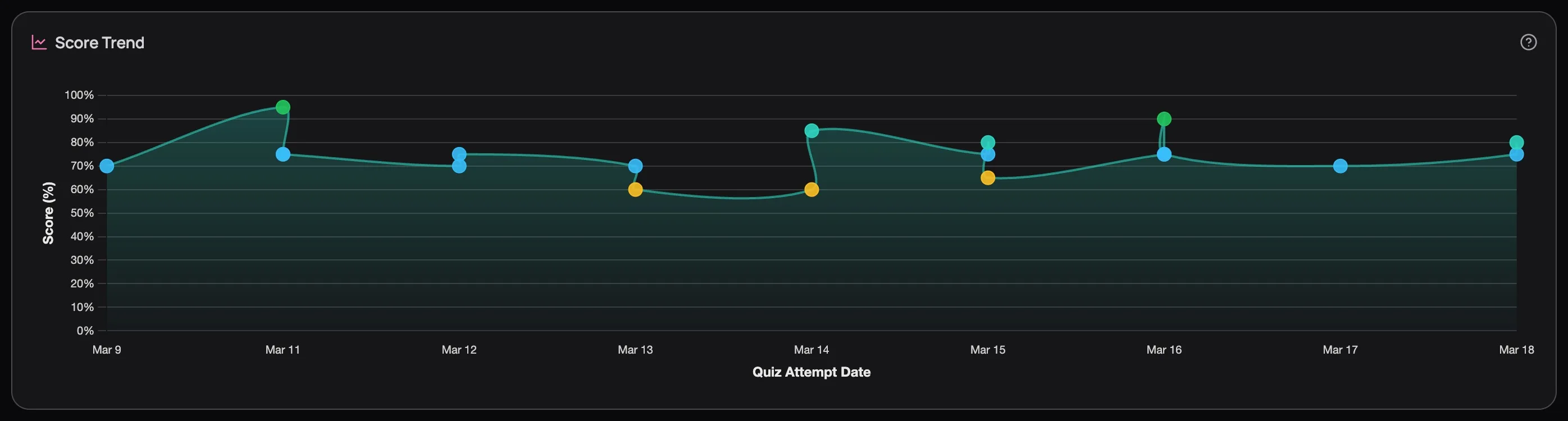
This tab is selected by default, and for good reason.
Every dot is a quiz attempt, colour-coded by score: green for 80%+, teal for 70s, yellow for 60s, grey for below 60%. Hover any dot to see the quiz name, score, and date. But you're not here for individual dots — you're reading the trend line.
Rising — whatever you're doing, keep doing it.
Flat for more than a week — you've plateaued. You've picked the low-hanging fruit and your current study approach isn't reaching the harder gaps. Time to increase difficulty, target weak subjects with custom mocks, or use the AI tutor to break through concepts you keep getting wrong.
Dipping — check what changed before you panic. Did you switch to harder content? Try a new subject? A temporary dip followed by recovery is the signature of someone pushing into unfamiliar territory — that's learning, not regression.
Zigzag — scores bouncing wildly between 50% and 90% means you're acing subjects you know and bombing ones you haven't touched. Subject Analytics will confirm exactly which ones.
Don't draw conclusions from fewer than 10 dots. One hard Pharmacology quiz can make your trend look like it's cratering when you're actually fine.
Quiz History: your complete record
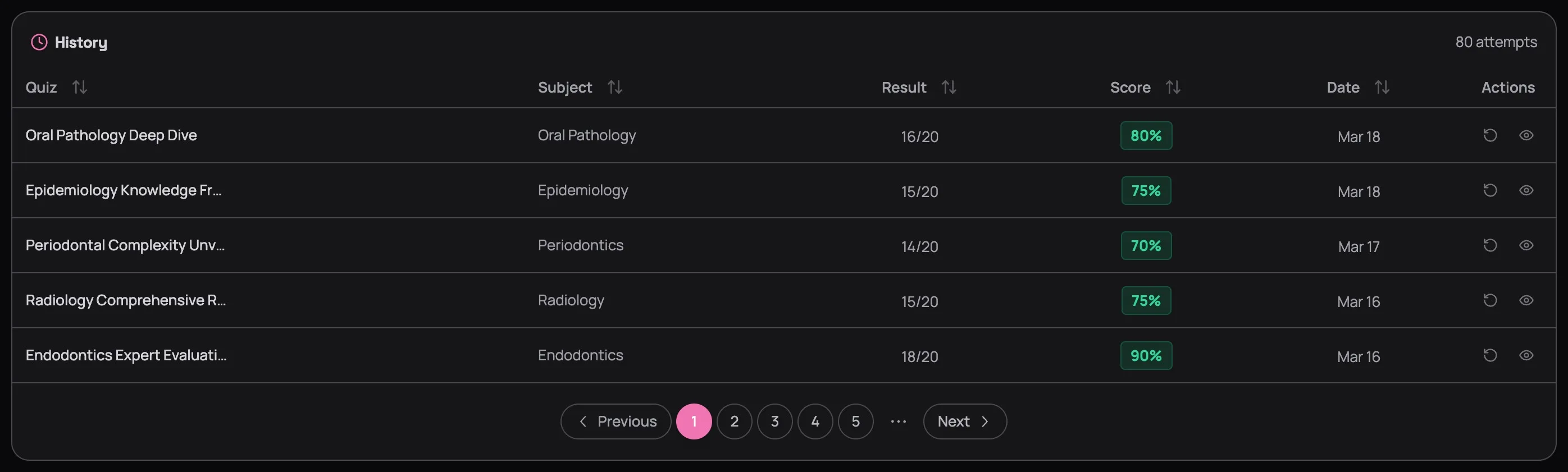
Every quiz you've ever taken, in one table. Click any column header to sort — Score ascending shows your worst results first, Date descending shows your most recent work.
Two actions on every row:
Reattempt (↻) — take the exact same quiz again. If you scored 60% two weeks ago and 85% today on the same questions, that's not just a number — that's proof the studying worked.
Review (👁) — reopen the full results page with explanations for every option. The results page is where the real learning happens, and it never expires. Explanations you didn't fully absorb in February will click in April after two more months of context.
Pick your worst quiz from two weeks ago and retake it. Score jumps? Your study approach is working. Score stays flat? You're reviewing without retaining — and that's a signal to change how you study, not how much.
Next Up
Your Score Trend is flat. Or zigzagging. Now what — which subjects are dragging you down? Are you bombing hard questions or just not seeing them? Three more tabs sit alongside the Score Trend, and each one answers a different version of that question. Read the Analytics Deep Dive to learn how.